


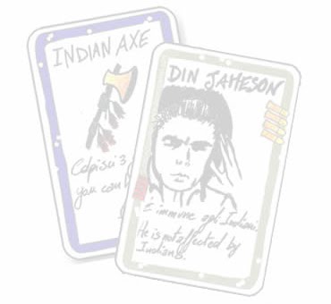
Since dv-Giochi placed blank character and playing cards in their special edition Bullet (and probably before then I concede), BANG! fans have become increasingly interested in making their own cards. My own Death Mesa and Robbers' Roost expansions are evidence of this, as well as El Dorado, O. K. Corral, and numerous images and files on the web. These custom cards come in a variety of formats and styles, and are produced at differing levels of quality.
Today, I wanted to start a tutorial that teaches others how to create a BANG! character card, in terms of conceptualization, design, and production. It will aim to teach you to create the highest quality cards and characters possible (at least, as far possible as I can teach you!). As a consequence, it may seem a bit elitist and daunting. The cards will be designed in both Adobe Photoshop and Illustrator CS3, which do cost a pretty penny. You may not have or be able to afford these programs. Adobe does, however, offer 30-day Trails if that interests you.
The first part in this series will focus on designing an image for a BANG! character card, which will mimic the images on other BANG! cards.
Part 1: Designing a Character Image for a BANG! Character Card
Let's take a look at a BANG! character card, and examine its image. In this tutorial, I will be looking at El Gringo:
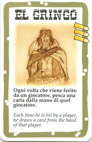
In terms of style, the things I notice about the drawing of El Gringo is:
- The image is sketchy, perhaps with a pencil, or etched. It has a cross-hatched effect in the sketch.
- There is a tannish background which varies in its darkness and lightness around and on top of the sketch.
- The sketch is pronounced on this background, not subdued and melting into it.
- The edges of the picture are not sharped and pronounced but blend into the white background of the card.
Those are the sorts of effects that we will need to recreate ourselves. I will present how to recreate these effects in a series of steps.
Step 1: Create a Name for your BANG! Character.
Picking a name for your character will help you in the design process. For one, it will help you select a gender, and perhaps also the style of the image and character's attitude (think of what "Slab the Killer" suggests, for instance). You might even think of the name in terms of its role: Outlaw, Renegade, Deputy, or Sheriff. A lot of the BANG! characters, and all of my Robber's Roost characters, are inspired by historical figures, Western actors, or a word pun on a western theme (like my "Loan Arranger" punning on the "Lone Ranger"). If you are having trouble thinking of names, slightly modify the name of a historical figure. You can find a complete list of Old West Gunfighters, Lawmen, Native Americans, Outlaws, Women, and Vigilantes at the Legends of America website. I used this site numerous times as I planned out my characters.
Step 2: Draw or Find a Sketch of a Western Character.
You will need to either draw your own character, or find one online that mimicks well the style of the official BANG! cards. If you opt to draw your own, study the official cards to get an idea of how they draw their characters. Try to create that cross-hatched effect yourself, which is often done in the shadows or dark clothes. In the El Gringo example, the cross-hatched effect goes in one general direction, but this isn't the case in all BANG! character cards. I tried to create this general cross-hatch effect myself with Jack West:

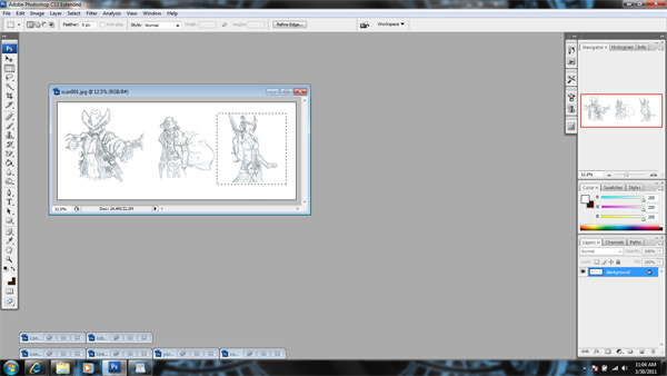
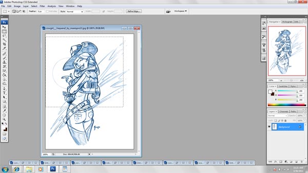
Once you have drawn one or more characters that fit the name(s) of the characters you picked, scan them on a computer. I would not take a picture of them on a camera! Use a scanner that allows you to scan the drawings to a very high quality. Quality is often determined in terms of DPI (data pixels per inch), and I wouldn't scan the images in anything less than 300. I typically scan my images at 600 DPI; this presents less problems for resizing, and allows you to have the highest quality print of your drawing later. Here is the outcome of such a scan on my ScanSnap:

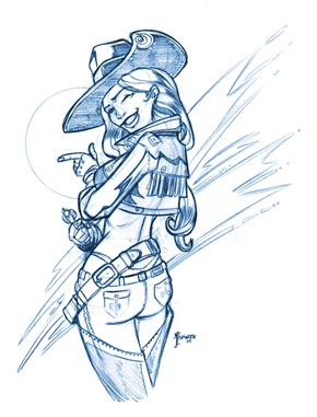
If you do not want to draw your own character, do not despair! There are several websites where you can find sketches: Concept Art, Google Image Search, and Deviant Art. As you browser through images (you can always search for "cowboy," "cowgirl," or "west gunslinger" for instance), try to pick images that fit the sketchy and slightly cartoony feel of the original BANG! cards. While it does not functionally matter too much in making your own card, it does create an aesthetic synthesis that brings at least to me great satisfaction. Thus, the picture on the left here is clearly a drawing of a Western character that could work, but it does not have the BANG! style. The picture on the right, however, is much closer, although it is still lacking in some areas.

When searching through other people's images you will have to decide how picky you are willing to be with their images. If you are so picky that you tend to like none of them, it's best to draw them yourself or get one of your artist friends to do some for you (free food for them can go a long way, eh?). Another consideration when browsing through art online is whether the image is large enough and of high enough quality. Since most images online are between 72-90 DPI, which looks horrible on print, you should only select images that are very large. That way you can resize these images later to be the appropriate DPI without suffering loss in quality. You can generally customize searches for larger images when using search engines. Artists on Deviant Art and Concept Art often post their pictures in larger sizes, so this is less of a worry with them.
Step 3: Adjusting your Image to be the Right Size.
Now that you have found or scanned in your drawing, we can fiddle with it to have the same proportions as the original BANG! cards. If you scanned in your image, you are going to want to select the art you are interested in and crop the image. Use the rectangular marquee tool and select the interested art in such a way that you enclose it in almost a square.
Then select from the top menu Image > Crop. It crops! You probably did not make a perfect square, so let us adjust the canvas size. Select Image > Canvas Size.

The Canvas Size window should pop open. You should see 2 input boxes for the image's width and height, as well as drop down menus next to them that provide options for the kind of measurement. Your width or height is bound to be larger than the other. It is now up to you whether to make the image larger or smaller by making the smaller size equal to the larger size, or the larger size equal to the smaller size. This decision will probably be made based on whether or not the drawing is running off the canvas, and on which side the image is running over. If the image is not running off the canvas on any size, shrinking the canvas is probably a good idea. If it is running over, you probably don't want to shrink the canvas, unless you are trying to zoom in on a specific part of the art.
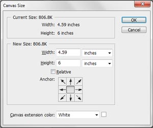
When adjusting the canvas size, you wil notice a square with 9 tiles. The inner tile is empty, while the other tiles have arrows pointing out in different directions. These arrows will specify where the canvas will be cut or expanded. For example, if I wanted to shrink the height of an image to equal the width, I could cut off the height at the bottom or the top of the image, or be cut off equivalently between the top and the bottom. The arrows control where the cropping (or expansion) takes place. If I wanted to crop the top of the image, I should select the down arrow. You will notice that the arrows and the inner tile will scoot down when you press the bottom arrow. The top 3 tiles will now be empty. These top tiles signify the area of the image that will be cut off at the top. Conversely, if you had selected up the up arrow, the arrows and inner tile would have scooted up, and the bottom 3 tiles would be empty. This would have signified the area from the bottom to have been cut off. As you can easily deduce, the left right arrows are used for when the width is to be adjusted, and the diagonal arrows are used for when both the width and height of the canvas are to be adjusted. Once you make your decision, press the "OK" button. The canvas will shrink or expand to the parameters you selected.
As you adjust a canvas size, some design decisions do come in. You may choose to crop the image smaller to focus in on a part of the image (if it is of high enough quality), and then shape it into a square with the Canvas Size tool. Or you may choose to simply extend the canvas of the full image to a square. Let's use the Cowgirl picture I showed above as an example. As nice a butt as this cowgirl has, I may want the character image to just show her upper half instead.
So I select a squarish select from her upper half and crop it (Image > Crop). I edit the canvas size to crop the sides from my cropped selection that was too wide (Image > Canvas Size). The outcome is this:
Conversely, I could simply take the original cowgirl image and edit the canvas size so that the width equals the height. If I do so, I have this outcome:

Both of them could make nice character images. Personally, I prefer the first one as it will be larger on the printed card. You will notice that very few BANG! cards show the whole body of each character, but you might prefer seeing the characters in their "full glory."
Anyway, once you have decided how you want the character art to be displayed and made the corresponding canvas size adjustments, you will need to resize the image. From my measurements, the BANG! character card images are approximately 1.563 inches (Photoshop won't let you go further than 3 decimal places, and for the naked human eye any difference beyond this is trivial anyway). We will want to resize our images to those measurements. So, resize the image by using the shortcut ALT+CTRL+I or selecting Image > Image Size.

The Image Size window should open. In the window, there should be input boxes for the width and height of the Document Size. Change these both to 1.563 inches (the measurement type to the right should be at inches by default). Below the Doument Size area should be an input box for the image's Resolution. Set this to 300 DPI (the measurement type should again be at pixels/inch by default, which is correct). Now, check your Pixel Dimensions, which is at the top of the window. It should list two file sizes right after the colon. The first size is the file size after the adjustments you have entered. The second is the file size before the adjustments you have entered. As long as the file size after the adjustments is roughly equal to or less than the file size before the adjustments (it can be a bit larger, but not much), you should end up with a image that will print very nicely as a BANG! card. If the file size is much greater, you will have to either adjust canvas sizes to have a smaller character on the card, or scrap this image altogether and select another one that will work better. It's a tough world. Once you have made this quality check, press the "OK" button. The image should be resized approriately!
Step 4: Adjusting the sketch's color and brightness/contrast.
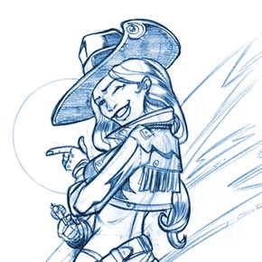
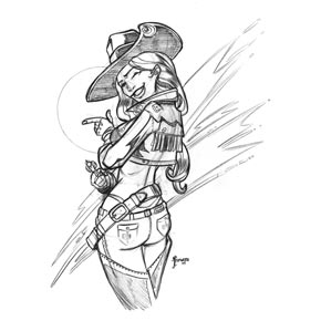
Many sketches that you find online or even sketch yourself will be the wrong color and brightness for BANG! cards. In the cowgirl example the sketch is in blue, which is not desirable. Fortunately, we can easily fix this problem in Photoshop. Just select Image > Mode > Greyscale. When a window pops up asking about discarding color information, select Discard. Your image's colors should now adjust to something like this:
We are doing this simply to standardize the colors of the sketches. Now, we will adjust the mode to CMYK, by selecting Image > Mode > CMYK Color. That way we can have more than black and white colors for this image.
The image that we drew or found online may be too bright (and possibly too dark) for a BANG! card. As we noticed with the El Gringo card, the character sketch was pretty pronounced. We can make our image more pronounced by selecting Image > Adjustments > Brightness/Contrast. A window should pop up that allows you to scale the Brightness and Contrast of the image. Since we want to darken the image, we want to lower the Brightness. In my example, I lower it to -40.
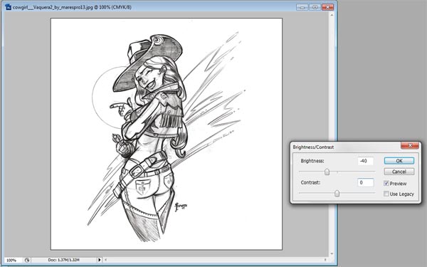
However, as you lower the Brightness of the image you will notice that lighter, even messy areas of the image become more pronounced. Sketches often have a softer layer that they are built upon and you don't want this soft layer to be pronounced. To fix this, increase the Contrast of the image. In my example, I am increasing it by 80.
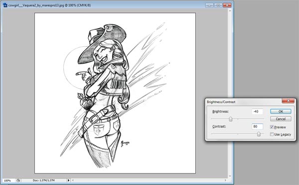
Now the main strokes of the image are darker and the softer layer is not pronounced. Good. Press the "OK" button. You now have a darker version of the original image.
NOTE: If doing this step has made the background around your sketch darker, then the sketch you picked was pretty dirty. I would recommend using the lasso tool and selecting the parts of the messy background that need clean up and then deleting them.
Step 5: Adding a Background Color.
The BANG! character images don't have a white background, so we need to find a way to place our sketch on a more tannish background. This is easy to do in Photoshop. First, make sure the Layers window is open (this is typically in the bottom left of the screen. If it is not open, select Window > Layers, or simply press F7. You should notice a window that has the current layer, labeled "Background" highlighted in blue. It should also have a padlock to the right of the "Background" text.
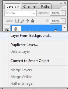
Right-click on this layer, and select "layer from background." A New Layer window should upon up; select "OK." The layer should now be renamed, "Layer 0." Next, click on the "create a new layer" icon, which is the page icon that has the left corner turning up. It is at the bottom of the window towards the right.
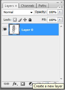
A layer should then be created that is above "Layer 0." It should now be highlighted blue and labeled "Layer 1." This new layer is the layer on which we are going to create our background. We need to get a good background color from an Original BANG! card. Pulling from the El Gringo image, we should select a color from the background that is not too bright or too dark, but represents a good middle for the colors of the tan background. I am going to use color #ffe1a1 for the background color, but you can always save the El Gringo image, and use the eyedropper tool to select the background color that you like. After you have selected a color, pick the Paint Bucket tool. Click on the image canvas and fill Layer 1 with this color.

Since Layer 1 is on top, the color should cover up the sketch. To make it show through we need to select from the drop down menu in the Layer window. The drop down menu we want has "Normal" as its default value. This controls the layer's transparency. We want to click on the drop down menu's arrow and select "Multiply." The sketch of the bottom layer should now show through as in the example above.
Step 6: Adjusting the Sketch Colors.
So far, so good. It should be immediately apparent that the sketch is too dark for the original BANG! cards, so now we are going to edit the sketch's color balance. First, select "Layer 0" in the Layers window, as we want to be editing the layer with the sketch on it, not the layer with the background color. Then open up the "El Gringo" image and place it next to the image you are trying to make. This original BANG! card image will function as a color control for your image.
Select the image you are creating and then pick Image > Adjustments > Color Balance from the top menu (or use shortcut CTRL+B). Now the Color Balance menu should open and you should see three different sliding scales for Cyan/Red, Magenta/Green, and Yellow/Blue. You are going to want to adjust these scales until the color of the sketch is close to the color of the El Gringo sketch. You will want to slide the Yellow/Blue scale all the way to the left, and move the Cyan/Blue about a third of the way to the right, and the Magenta/Green about a third of the way to the lift. Then near the bottom of the Color Balance window you should see an area called Tone Balance with 3 radio buttons: Shadows, Midtones, and Highlights. Midtones should have been the one currently selected. Select Shadows, and then alter the 3 scales again until it best matches the El Gringo sketch's colors. Each image will differ some in how much it needs to be adjusted. But you should be able to match the colors pretty closely.

If you find that your sketch is too dark, fiddle with the Brightness/Contrast controls, and then the Color Balance tools again, until you get the right mix. Your sketch is now complete!
Step 7: Editing the Background to have a BANG!-like Feel.
In comparing our current image with the El Gringo image, we will quickly realize that our background is static; just 1 color. The El Gringo background has a lot of variety to it. We can create some variety to our background by using the Burn and Dodge tools. These tools are located 2 spaces below the paint bucket tool.

In this image, I have the Dodge tool selected. Click and hold down on this tool and slide your mouse slightly to the right. A menu should appear to the right with 3 options. Select the middle one that has the hand icon, which is the Burn tool. Just below the top menu, you should notice some tool options for the Burn tool. The second item over in the tool options should be labeled, "Brush." Click on the arrow to the right of it. A window should appear that allows you to select the diameter of the burn tool.

Type in 100 px into the Master Diameter input box, and then press the arrow to the right of the "Brush" label again to close the window. Next, look for the "Exposure" label in the Tool Options menu. Input 30% into the input box. Now we are ready to use the Burn tool. Click on the image that you are trying to edit and then select "Layer 1" from the Layers menu. This is the layer that has the background color on it that we wish to edit. Move your cursor over the image; you should see an outlined circle that demarkates the area the Burn tool will affect on the image. By holding down the cursor over the image, and moving the cursor around the image in the areas you wish to darken, the image will correspondingly darken. Fool around with this a bit. If you don't like the move you just did, you can always press ALT+CTRL+Z to move one step back. Once you get the hang of it, darken parts of the background to your liking. For certain parts of your image where you want a smaller burning circle, press [ to decrease the size of the circle (conversely, you can press ] to increase it).

After you are done darkening the background, you may also want to brighten parts of the background. For this, you will need the Dodge Tool. Click and hold on the toolbar where the Burn tool is selected and move the cursor slightly to the right. A menu should appear to the right with 3 options. Select the 1st option with the black magnifying glass, which is the Dodge tool. The Dodge tool can be customized just like the Burn tool and I would recommend customizing it just as the Burn tool was above. You use the Dodge Tool just as the Burn tool is used. Use it to brighten desired areas of the image to create a background similar to that in the El Gringo image.

Once you have done so, you should have a background that looks something like this example. We are almost done!
Step 7: Editing the Image Border.
As we studied the El Gringo image, we noted that the edges of the image slowly fade into the white. We can create a similar effect ourselves. Begin by creating a new layer (remember, click the icon that has a page with its left corner turning up at the bottom of the layers menu). "Layer 2" should now be created. Click and drag this layer below "Layer 0" and then let go. Next, select the Paint Bucket tool. You will want to choose the color white. Click on the left pallette near the bottom of the toolbar. In the color gradient that upons up, click and drag the circle in the color gradient to the top left corner (RGB should all be at 255). Then click "OK." Then click on the image with your Paint Bucket. No visible effect should have happened yet. We are doing to have a clean white base at the bottom of our image. While in my cowgirl example the background is already white, this is not the case for all images, and definitely is not the case with full color images used for custom BANG! playing cards. I think this is a good habit to establish when making BANG! card images.
Now select the Rectangular Marquee Tool (the second tool on the toolbar). A tool options menu should open again just below the top menu.

Look for the label named "Feather" and type in 4 px into the input box. Then, select Layer 1. Next, using the rectangular marquee tool position the crosshairs of the cursor in the top left corner of the image with the top hair of crosshairs touching the top edge of the image and the left hair of the crosshairs touching the left edge of the image. Hold down the cursor at this point and drag it all the way over to the bottom right corner of the image, having the bottom hair of the cursor touch the bottom edge of the image and the right hair of the cursor touch the right edge of the image. Then, release to make this selection.

You should have a selection something like this, with the selection having rounded corners. Now pick from the top menu Select > Inverse (or press SHIFT+CTRL+I) to invert the selection. Press the delete key. Then, select Layer 0 and press the delete key again. The edges of the image should now fade a bit into the white base of Layer 2. Your image is now complete! Select File > Save As from the top menu (or press SHIFT+CTRL+S) to save the image. I would save it in the Photoshop format (.psd). This format will preserve the layers of the image, which will help you if you wish to edit the image in the future.

Congratulations, you have taken some important steps towards making your own custom BANG! Character cards. In the next part of this tutorial, I will how to incorporate custom images like these into the BANG! Master Template for InDesign.
what is the ability of the indian axe in your picture above? It looks interesting
ReplyDelete