News (9/12/11): Added in the missing step for adding in the bullet images for 3/4 life point characters.
With the release of the
BANG! Master Template (available for InDesign CS4-CS5), I have wanted to create tutorials that show how to use it. This guide will use the BANG! Master Template, and finish up on the first part of a tutorial that teaches how to make custom BANG! characters. Thus, before reading this tutorial, I recommend you first read the tutorials on
how to create and balance a character ability, and
how to create a character card image (the first part of this tutorial).
STEP 1: Open up InDesign and load the BANG! Master Template.
I am acting under the assumption that you have downloaded the
BANG! Master Template and that you have not made any changes to it. If not, download the template or start with a blank template. Once you have loaded the file, it should look like this (at least in CS5).
 STEP 2: Prep the Template for Character Cards.
Make sure the Layers window is open. You should see a list of 28 layers. You should notice which layers are visible due to the eyes being present at the boxes to the far left of the layers. Scroll to the bottom. We are going to prep this character card sheet from the bottom up, making the necessarily layers visible and unnecessary ones invisible. Let's do it in this order:
- Turn off the "Brown" layer by clicking on the eye corresponding to that layer.
- Turn on the "BORDERS: Character" layer by clicking on the far left box of that layer. An eye will appear, as well as the character border.
- Turn off the "Playing" layer.
- Turn on the "TITLES: Character" layer.
- Turn off the "Playing C" layer.
- Turn on the "ART: Character" layer.
- Turn off the "Playing Card" layer.
- Turn on the "TEXT: Character" layer.
- Turn off the "VALUES: Playing," "Hearts," and "Playing Back" layers.
- Turn on the "BACKS: Character" layer.
The end result (of the fronts) should be as below.
 STEP 3: Add Character Name(s).
Using the Selection Tool (the black looking arrow in the toolbox, shortcut "V"), double-click inside one of the text boxes entitled "NAME." Then, select all of the text (shortcut CTRL+A), and type in the name of your character. NOTE: This you should have picked out earlier; I have tips for this in step 1 of the
first part of this tutorial.
If the name is too long for the text box, we will have to scrunch the text. In my example, where I am trying to input "Crazy Wolf" as the name, this is the case. To scrunch the text, select all of the text in the name (CTRL+A inside the textbox again). Then, notice the long horizontal toolbar across the screen, showing typing tool options. We want to adjust the "Horizontal Scale" of the text. The option for doing this is identified by the stretched out T icon.
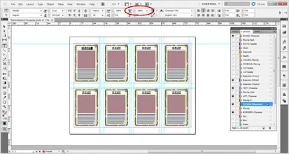
We want to change the value in the input box to the right. Its default value is 100%. Since our text is too long, we will want to lower that value. Click once in that text box, and then use the down arrow on your keypad to decrease its value until it fits snugly in the text box. For Crazy Wolf, I just had to adjust the Horizontal Scale to 97%.
It is also possible that your name is too short (as in the case of a name like "Jack West"). The names for characters in BANG! are stretched to fit the width of the character art images, unlike the playing cards. To stretch the names, we will again use the Horizontal Scale. Instead of decreasing its value, we will increase the value. Select inside the input box with your cursor and then use the up arrow on your keypad to increase the value. For Jack West, I had to adjust the Horizontal Scale to 108% to fill the text box. The end results look like this.
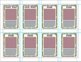
If you have more than 1 character, keep adding in names into the text boxes entitled "NAME," and adjusting the Horizontal Scales on them as needed.
STEP 4: Add in Character Images.
Using the Selection Tool, select one of the lavender squares undernearth one of the character cards you have named. We are now going to place in the image you created for this character card in the
previous part of this tutorial. With the lavender square selected, either select from the top menu File -> Place... or use shortcut CTRL+D.
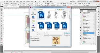
A window will appear allowing you to select an image to insert. Locate the image, select it, and then click on the highlighted "Open" button.
The chosen image should replace the lavender box, but maintain its dimensions. If the image does not look proportional, then select the image and then use shortcut ALT+SHIFT+CTRL+E. This should fit the content of the image proportionally to the frame. If it still looks off, then your imported image was not square. Either fiddle with it to your liking, or edit the image in Photoshop, so that it is a square. The end results show be like this.
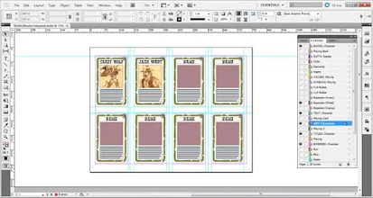
If you have more than 1 character, select on the next lavender box where you want to add a character image, and use the place function to add it in. Adjust the image as necessary.
STEP 5: Add in Character Ability Text.
Using the Selection Tool, double-click inside one of the text boxes with the long string "textextextext...." underneath one of the character cards you have named and provided an image for. Select all of the text in the box (CTRL+A), and delete it. Then replace it with the text for your character ability, which you might have designed in conjunction with
this tutorial.
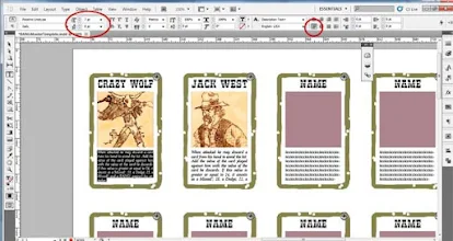
Next, justify the text with the last line aligned left. Do this by selecting all of the text (CTRL+A) and then clicking on the appropriate justification icon. You should notice 8 text orientation icons available amongst the long horizontal bar displaying typing tool options. You will want to click on the one in the bottom left. Afterwards, turn off the hyphenation if that is a problem. Go to Window -> Type & Tables -> Paragraph. A window should appear. In the bottom left there is a check box for hyphenation. Make sure it is empty to disable hyphenation.
If the text is too long, your options are:
- Trim the text by getting rid of superfluous words and rephrasing statements in shorter ways.
- Adjust the font size. Select all of the text in the textbox (CTRL+A), and then adjust the size by clicking inside the input box for font size. This is in the tool options horizontal bar for the Typing Tool. It is identified by the small T, big T icon. Its default value should be 8. Change this to 7. Directly below that input box is an input box that alters the leading in between lines. Its default value is 9. Change that to 8. If your text still doesn't fit, consider:
- Extending the border of the text box a little further down. Click on the bottom border and extend it. If that doesn't work, perhaps:
- Make the ability simpler so that it is not as convoluted to explain.
Add in any remaining text for other characters.
STEP 6: Add your Expansion Icon.
By default the wagon wheel icon is in place. Feel free to use this icon as your custom expansion symbol. If you prefer another, I have provided both a cactus icon and a bow and arrow icon. Any of these icons can be swapped out by going to the layers menu, and turning on the "Expansion" layer you like. Turn off the "Expansion" layers you do not like.
You may wish to make your own. If so, follow my tutorial on
making your own BANG! expansion icon. If you have the icon ready, go to the layers window and select one of the "Expansion" layers, or create a new layer just below those layers. Either way, with an appropriate layer selected, place (CTRL+D) your custom expansion icon into it. Use the already provided expansion icons as guides for where to place your custom icon. If your icon is too large, simply adjust the image frame so the it is the same size as one of the provided expansion icons. Then use shortcut CTRL+ALT+SHIFT+E to resize the custom icon proportionately to the frame. Feel free to fiddle with the image frame and resizing until you get it towards something you like. If you have more than 1 card, simply copy the custom icon (select it and use shortcut CTRL+C) and paste (CTRL+V) a new one. Then move it over to the next card and put it in the appropriate place.
STEP 7: Add in Life Point Bullets.
For each of your characters, you should decide whether they merit having 3 or 4 life points. Typically, very powerful abilities merit 3 life points, while weaker abilities merit 4. Once this has been decided, you can add in the life point bullets by using the "3 LP Bullets" and "4 LP Bullets" layers. First, turn on the "3 LP Bullets" layer. This should make images of 3 bullets appear on each card. We only want those images to appear on the character cards that need it. To remove the others, we need to make the individual images identifiable. Do so by clicking on the right facing arrow next to the "3 LP Bullets" label in the Layers menu. This will reveal a list of 8 elements, each entitled "Bul" with a numerical ending. The number at the end of the element describes the card that it corresponds to. The guide for the numbering is provided in the image for step 8. Turn off all elements that do not correspond to a character card that has 3 LPs. In my example, only Crazy Wolf is a 3 LP character, so I will only keep the element "Bul5" visible.

Now, for the 4 LP characters if you have any. Turn on the "4 LP Bullets" label, which will make 4 bullet images appear over all of the cards. You will notice that these cover up all of the 3 bullet images that were there previously. We will need to turn off all of the elements that do not correspond to 4 LP characters. Do so in a similar manner as we did for the 3 LP images. In my example, only Jack West is a 4 LP character, so I will only keep the element "Bul6" visible. The end result is this:
 OPTIONAL STEP 8: Turn Off Unused Material.
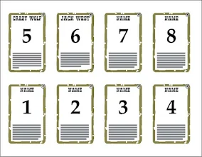
You may not fill up an entire card sheet with characters and that is fine. For printing purposes, you will not want superfluous images and texts being printed, and so we should make that stuff invisible. Let us start with the borders. In the layers window, look for the layer entitled "BORDERS: Character." There should be a right-faced arrow to the immediate left of the text label. Click on the arrow to have various layer elements appear. Each of the elements should be labeled "Char" with a 1 through 8 tacked on at the end. These numbers correspond to the 8 cards, as identified in this image:
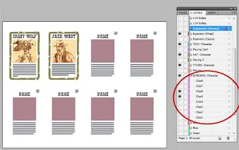
We will want to turn off all the elements named "Char" that correspond to the unused card numbers. So, in my example I want only "Char5" and "Char6" visible. The rest I should turn off. The result is this:
A similar numbering system is present in most, but not all layers. Text elements to be disabled in all layers are easily identified, since the elements all have the default names ("NAME" or "textextext..."). Turn off all of those superfluous text elements in "TITLES: Character" and "TEXT: Character." In the "ART: Character" layer, turn off all elements with the "
" value. Turn off unnecessary expansion icons in your "Expansion" layer (or custom layer).
All that is left is the "BACKS: Character" layer. Scroll down to the next page. Display the layer elements for "BACKS: Character" in the Layers window. While the elements have the familiar numbering system, they correspond to the backs in an inverse way as shown below:
 This is needed for making sure the cards print the backs correctly on the right fronts. Just make sure the #s on the fronts you kept visible (in my example, "Char5" and "Char6" were visible) are the same ones kept visible on the backs (thus, only "CharBack 5" and "CharBack 6" should be visible). The result is:
 Your card sheet should now have all superfluous material removed.
STEP 9: Export your Card Sheet to PDF.
Now that your card sheet's design is complete, export it to PDF. Do this by selecting File -> Export... from the top menu, or by using shortcut CTRL+E. A window will appear, where you must specify a name and location for the exported file. Click save.
An "Export Adobe PDF" window should appear. Make sure the radio button "All" is selected for Pages. Under the Options area, select "Visible Layers" from the Export Layers dropdown menu. Also check the "View PDF after Exporting" box. We will now need to go to the "Compression" section. Select that label from the lefthand column.
 Make sure that in the Color Images and Grayscale Images ections that the downsampling is specified as bicubic to 300 ppi for images above 300 ppi (pixels per inch). Then click on the blue highlighted "Export" button.
 When it is done exporting, the PDF file should appear. Your character card sheet is now complete and ready to be printed off. If you wish to keep the design file (recommended), go back to InDesign and save the character card sheet InDesign file under a new name. This way you will have the design file for the characters if you want to make any adjustments in the future, and you will also have a clean Template to make more cards with in the future.


Hi! Nice site :) I've been lurking for a while. I'm writing here to rember to add one thing you've forgotten: The bullets that indicate how many life point a character have :)
ReplyDeleteAy! Good catch--I'll input that tomorrow. Don't know how I forgot that! :{
ReplyDeleteTook a little longer than August 25th... but I got it in! :)
ReplyDeleteHey, I was curious if the master template works on cs6. If not, is there any way around it?
ReplyDeleteIt works with CS6.
ReplyDelete