


My proof for Robbers' Roost arrived last night, and I was eager to open it up and see the results. Here's my assessment, with lots of photos!


What worked well:
- The size is fantastic as I'd fully expected, but it's still super rewarding to be able to order BANG! cards that are in the card size necessary to fit into the BANG! playing deck on demand. It's a giant leap forward for modders.

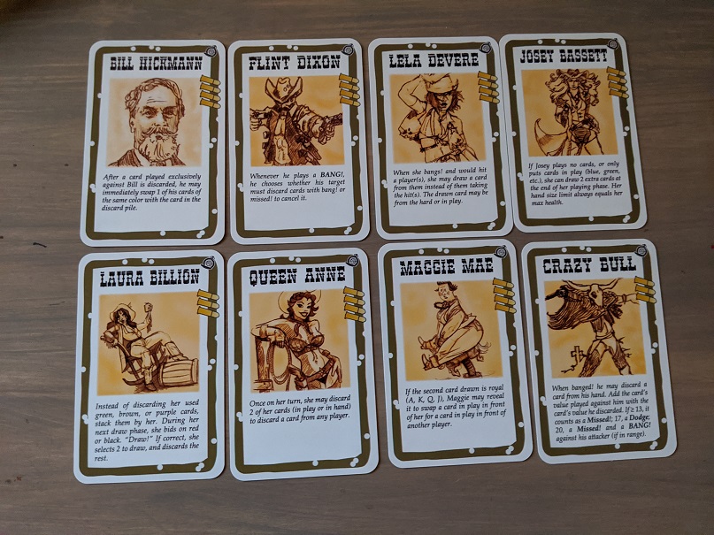
- New border designs turned out really well.


- Character design looked really crisp.
- Cards shuffle well.
- Did well on border spacing -- which I was worried with as related to the closeness of the borders to the edge in the BANG! cards v. the game crafter's template. I exceeded their recommended area ever so slightly to limit that design variance. Turned out well.
- The rulebook from game crafter turned out really nice too. I'm happy to offer this alongside the cards that you can print out. I caught a couple typos, but that's what proofs are for, right?


What needs work:
- Colors: These always print differently than you suspect on a monitor v. your home printer v. the POD's. And they also differ slightly on printing runs. You can notice some significant differences between the official BANG! card prints in between the expansions -- Wild West Show character borders are lighter, for instance, and their backs have a more orange hue. So I suspected differences here, and knew they would lack the linen texture that the official cards have. That said, I didn't expect the level of variation I saw in my proof. They're perfectly playable, but I'd still like to get this closer if I can. In general, the cards were darker:
- Borders too dark


- Card backs too dark (see far right cards):


- Bullet life points too dark (and a little small; this is on the front of the character card)
- A couple pieces of card art were darker than I'd like (Q&A, Pay Day, Disarm; only Q&A was really too dark, but I should still lighten all of them up)

Other observations:
- The printing, while pretty good in the quality of the prints, is a little blurry in some print areas. It's not a result of the media files, but the printing process itself. This is a minor quibble, but something I noticed.
- Design side -- I should make my icons slightly bigger. Some of the borders of my character art should be more feathered (gradient to white). Spacing between suit and value should be a little larger.
- Tuckbox definitely needed! This will compliment the cards and rulebook really well, so you can store Robbers' Roost and cart it around easier. I'll want a divider too.
I am pretty sure I can leverage this material:
https://www.thegamecrafter.com/publish/product/SmallProBox
https://www.thegamecrafter.com/parts/box-insert-pro-small


I've got 88 cards (44 to each side) plus a 20-page saddle-stitched booklet, which I think will work great. The 128 card limit for the box (64 to each side) gives me a 20-card thickness for the booklet, so I should be good. The wild card here will be how the divider works with the booklet. I'd hate for the cards to be completely loose, so divider is a must. Time to get cracking on some art. I'll make it pretty generic, but at least somewhat aesthetically pleasing.
Ideally here, you can "build your own" Robbers' Roost with all needed components, even if you have to somewhat assemble them once shipped to you.
- Curious if I can create a standardized way for the POD to print all of the "Dying Ain't Living" and then the "That'll be the Day" modules sequentially, so that no card sorting is needed.
Nice Work!
ReplyDeleteI think I'd better wait for your border&color matching. It would be unwise to deliver massive amounts of test decks to Korea, which is likely to take months.
Yes -- I am also working to reduce the text heaviness of the interrupt cards. I've been working to utilize more symbols, and create an easier way to follow their conditions (when they can be played).
ReplyDeleteWould you provide the borders in Robbers' Roost later? I have orange and purple cards in old version in my expansion, BANG! Brawl.
ReplyDeleteSure thing -- I did use a completely different template creation engine though. I used Photoshop to align with the Game Crafter, and then used a new batch variable process that automates graphics, text, etc. I do have to adjust it thereafter, but it's alright. Anyway, this completely replaces my old BANG! Master template.
DeleteI also use different template. It is based on indesign, but it creates a single card, instead of 8.
DeleteI also add ! to perdido fon; here-> https://blog.naver.com/tantive4/222105735329
Nice idea -- I'd always wondered if one could just add a glyph to that font, and had just never bothered to figure it out. I applaud you for the effort!
Delete